New Look, Same Mission: Our Company’s Logo Redesign
You might have noticed something a little different about Yugabyte this morning if you visited our website, read our blog, or stopped by on LinkedIn.
We are excited to share our new logo, the first step towards refreshing our brand identity!
Yugabyte’s mission—to be the cloud native database of choice for all business-critical applications—remains the same, but we are stepping out with a fresh new look!

Let’s start with the why.
Over the past few years, YugabyteDB has become the database modernization platform of choice for Fortune 100 companies and innovators in financial services, retail, manufacturing, tech, telecommunications, and more.
Whether it’s the largest supermarket chain in the US, a top 5 global retailer, a top 5 global auto manufacturer, a cybersecurity leader, or a cutting-edge fintech, these companies all trust YugabyteDB to power their business-critical workloads.
We felt it was time to refresh our brand identity to better convey where we are headed while still reflecting our vision and values.
Where We Started
Yugabyte was founded in 2016 by former Facebook engineers Kannan Muthukkaruppan, Karthik Ranganathan, and Mikhail Bautin. They worked on the team that built and operated one of the first web-scale databases, Cassandra, in response to the massive scaling needs of Facebook services. The same team also built and operated a popular non-relational database, HBase.

Armed with this experience of engineering and operating highly-scalable, resilient, cloud native databases, Karthik, Kannan, and Mikhail started Yugabyte. Their mission was to build a market-leading, cloud native, relational database for enterprises.
Yugabyte launched our first version of YugabyteDB in 2018, making the database available under the Apache 2.0 open source license soon after. This license change went against the trend of database and data infrastructure companies abandoning open source licenses for some or all of their core projects.
The Brand Evolution
The company name Yugabyte is derived from two words — the Sanskrit word “yuga” which means an epoch or an era, and the word “byte” which conveys data. Together, the name Yugabyte is intended to reflect data that lives on (forever) without limits (around the world, at any scale).
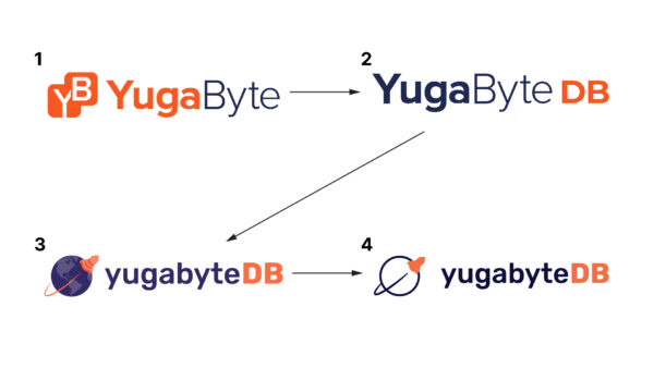
Yugabyte has been operating for over seven years, and our logo has evolved along with the company.

Along the way, the company name changed from “YugaByte” to “Yugabyte.” The name of the database evolved from “YugaByte DB” to “YugabyteDB.”
What the New Logo Represents
We wanted our new logo to convey the boldness, innovation, minimalism, and energy of our trusted, modern, market-leading database company.
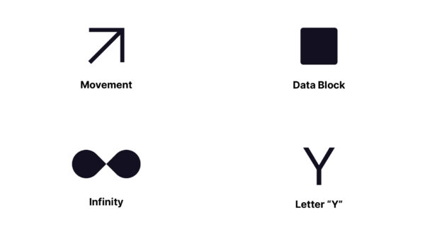
The new logo design incorporates the three symbols that tell our story:
- A data block, because … database! 🙂
- The infinity symbol which represents the concept of data living forever, growing without limit, and being deployed globally in any hybrid or multi-cloud environment.
- An arrow moving up and to the right to represent movement, progress, and innovation
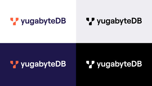
The new logo combines these symbols into the first letter of our name – Y.

As well as a logo change, we also fine-tuned our color palette while still sticking with orange, blue, and white.


Together, these carefully-considered design and color choices give the Yugabyte brand and logo a bold, fresh, new look, designed to propel us into the future!
We’d love to hear what you think about the new look. Drop us a note below, or share your thoughts on LinkedIn or Twitter!


